When to Use KeyboardAvoidingView: A Practical Guide
Learn when and how to use KeyboardAvoidingView in React Native to prevent keyboard overlap across iOS and Android, with practical tips and examples from Keyboard Gurus.

KeyboardAvoidingView helps keep inputs visible when the on-screen keyboard opens. Use it when a form's fields risk being obscured on iOS or Android, especially on simple screens with a vertical layout. For complex, scrollable forms you may combine it with ScrollView or explore alternatives. When to use keyboardavoidingview? In lightweight UIs, it’s a natural fit.
What is KeyboardAvoidingView?
KeyboardAvoidingView is a layout wrapper in React Native that shifts its content to prevent the on-screen keyboard from covering inputs. It addresses a common UX problem across iOS and Android, letting developers avoid writing manual listeners for keyboard events. When to use keyboardavoidingview? In lightweight UIs, it’s a natural fit. The component is most effective for simple, vertically stacked forms where the keyboard would otherwise obscure the active field. For more complex or highly customized layouts, plan to pair it with other layout strategies, such as ScrollView, SafeAreaView, or additional padding. The key idea is to give the keyboard room to push content up or resize, so the user can see the active field without frustration. It’s not a universal fix; in some cases you’ll need alternatives or multiple wrappers to achieve the desired UX.
KeyboardAvoidingView works best when the screen structure is predictable and inputs are near the bottom of the view. If your layout relies on absolute positioning or heavy nesting, you’ll want to test thoroughly and consider complementary solutions. Keyboard Gurus emphasizes testing on both platforms because differences in how iOS and Android handle the keyboard can affect the final feel across devices.
The keyboard-visibility problem across platforms
When the soft keyboard appears, it can occlude input fields, especially on small screens. iOS tends to push content and offers smooth transitions via its built-in keyboard APIs, while Android may overlay views or resize layouts differently depending on windowSoftInputMode and other settings. KeyboardAvoidingView provides a predictable behavior by adjusting padding, height, or position, depending on the platform. The most important decision is choosing the behavior prop: 'padding' for iOS to create space, 'height' for Android to resize the container, or 'position' for certain custom layouts. KeyboardVerticalOffset helps compensate for headers, safe areas, and navigation bars. This component is not a universal fix; in many forms and nested scrollable regions you’ll still need a ScrollView, a keyboard-aware wrapper, or manual focus management.
Keyboard Gurus research indicates platform-specific nuances can influence how much space you gain and where the content moves. Always verify on real devices when possible, not just simulators, to ensure a consistent experience across environments.
Scenarios where it shines
KeyboardAvoidingView excels in scenarios where form fields sit close to the bottom of a compact screen, and the user needs to see what they are typing without scrolling away. Typical use cases include login screens with username/password inputs near the footer, small-profile forms in nested views, and chat inputs that live at the bottom of a compact panel. For straight linear forms with a single column of inputs, you’ll often achieve a clean UX with a lightweight KeyboardAvoidingView wrapper alone. In longer forms, pairing it with ScrollView allows the content to scroll while keeping the currently focused field visible and properly offset from the keyboard.
It’s also helpful in onboarding flows or settings panels where your layout remains predictable and you want minimal boilerplate. Always consider the user’s intent: if they need to jump between fields quickly, ensure the keyboard doesn’t obstruct the next field as they tap through. KeyboardAvoidingView can deliver a smooth, native-feeling adjustment when used thoughtfully.
When you should not rely on KeyboardAvoidingView
There are cases where KeyboardAvoidingView doesn’t provide the best UX. If your layout relies heavily on absolute positioning, overlays, or complex nested structures, the keyboard can still obscure important elements. For very long forms, reliance on KeyboardAvoidingView alone may lead to awkward offsets on certain devices. In some scenarios, using a dedicated keyboard-aware scroll view or custom keyboard listeners yields more predictable results. If you need precise control over which element moves during keyboard appearance, consider alternative approaches or additional wrappers and test across OS versions. Keyboard Gurus recommends evaluating the user flow before choosing a solution to avoid fragile layouts.
Also be cautious with certain third-party components that manipulate focus or scroll independently; overlapping behaviors can create jitter or inconsistent offsets. The goal is a seamless experience where the shift just feels natural, not jarring.
Architecture: combining KeyboardAvoidingView with other wrappers
A robust layout often combines KeyboardAvoidingView with ScrollView and SafeAreaView. A typical pattern is to place KeyboardAvoidingView as the outer wrapper, a ScrollView inside for long content, and SafeAreaView to respect device notches and safe areas. This approach lets the keyboard offset be predictable while preserving a scrollable container for content that exceeds the screen height. Carefully set the flex and padding so that the ScrollView’s content container grows naturally without fighting the keyboard’s layout shift. Remember to test with headers and navigation bars that contribute to the overall offset.
Designers should aim for a single source of truth for the layout shift and avoid layering too many wrappers, which can complicate behavior. Keyboard Gurus notes that a simple, well-structured tree often yields the most reliable results across devices.
Important props and common gotchas
Key props to understand are behavior, keyboardVerticalOffset, and enabled. The behavior prop can be 'padding' (common on iOS), 'height' (typical on Android in some setups), or 'position' (for specialized layouts). keyboardVerticalOffset should account for status bars, headers, or safe-area padding. enabled toggles the effect, useful for conditional forms. If your app uses a header or toolbar, set keyboardVerticalOffset to the header height or a value that preserves consistent spacing. A frequent pitfall is assuming a single offset works across all screens—test with different device heights to avoid hidden fields.
Another gotcha is combining KeyboardAvoidingView with nested ScrollViews; ensure the inner ScrollView handles its own keyboard interactions and does not trigger conflicting offsets. In practice, start with a simple 1-2 field form to validate the offset, then expand to more complex layouts. Keyboard Gurus recommends avoiding absolute positioning inside the moving area when possible, as it can complicate the offset math.
Practical code example: minimal usage with common patterns
A minimal, reliable setup looks like this:
<KeyboardAvoidingView behavior={Platform.OS === 'ios' ? 'padding' : 'height'} style={{flex:1}} keyboardVerticalOffset={64}> <ScrollView contentContainerStyle={{flexGrow:1}}> <View style={{padding:16}}> <TextInput placeholder="Email" /> <TextInput placeholder="Password" secureTextEntry /> <Button title="Login" onPress={() => {}} /> </View> </ScrollView> </KeyboardAvoidingView>
Notes:
- For iOS, 'padding' often provides the smoothest shift.
- For Android, 'height' can feel more natural on dense forms.
- Adjust keyboardVerticalOffset to account for headers and status bars. Always validate on real devices.
This pattern keeps the active input visible when the keyboard appears and works well for lightweight forms while preserving scrollability for longer content.
Testing tips across devices
Test on both iOS and Android devices to confirm the offset remains intuitive as you navigate fields. Use devices with different screen sizes to verify the behavior in both portrait and landscape modes. Pay attention to the status bar height and any header components that contribute to the vertical offset. If you notice flickering or abrupt jumps, re-evaluate the behavior and offset values. Automated UI tests can help catch regressions related to keyboard interactions, but manual testing is essential for a tactile sense of polish. Keyboard Gurus recommends documenting your platform-specific offsets to streamline future screens.
Alternatives and complementary approaches
If KeyboardAvoidingView alone doesn’t meet all needs, consider complementary solutions. The react-native-keyboard-aware-scroll-view library provides a ScrollView that automatically handles keyboard interactions with fewer caveats in complex layouts. You can fallback to a dedicated keyboard listener to fine-tune focus management or adjust the layout when the keyboard shows or hides. For apps with highly customized headers, integrating a custom offset calculator that reads header heights can provide precise alignment. Ultimately, the best approach is to choose a pattern that preserves content visibility, feels native, and remains maintainable across screens and OS versions. Keyboard Gurus suggests starting simple, then layering in alternates only if you hit edge cases.
Tools & Materials
- React Native development environment(Node, npm/yarn, Android Studio/Xcode as needed, and an emulator or device for testing)
- Code editor(VS Code or any IDE you prefer with React Native tooling)
- Optional: keyboard-aware library(Consider react-native-keyboard-aware-scroll-view for complex layouts)
- Device for testing(Real devices recommended for best results, plus simulators)
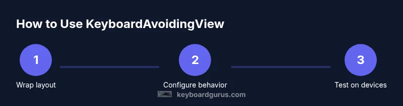
Steps
Estimated time: 15-30 minutes
- 1
Plan layout and identify bottom inputs
Review the screen to identify input fields likely to be obscured by the keyboard. Decide which parts should move and whether scrolling will be needed. This planning prevents overengineering later and sets up a clean, predictable user flow.
Tip: Map input order before changing layout to avoid unnecessary rework. - 2
Install/prepare components
Ensure React Native project is set up and import KeyboardAvoidingView, Platform, and ScrollView if needed. Confirm the development environment is working and your dependencies are up to date.
Tip: Keep versions consistent across iOS and Android to minimize behavior differences. - 3
Wrap your layout with KeyboardAvoidingView
Place KeyboardAvoidingView as the outer container (or near the top of the view tree) to let the keyboard offset affect all children properly. Use a practical style that fills the screen.
Tip: Avoid placing inside elements that require absolute positioning at the top level. - 4
Configure behavior prop
Set behavior to 'padding' on iOS and consider 'height' or 'position' on Android depending on your layout. This choice affects how space is created when the keyboard shows.
Tip: Test with both platforms to see which behavior yields the best UX. - 5
Adjust keyboardVerticalOffset
Tune keyboardVerticalOffset to account for headers, status bars, or safe areas. A common starting point is a value around 64, then adjust based on the device.
Tip: Use device-safe offset values rather than static constants when possible. - 6
Integrate ScrollView for longer forms
If your form exceeds screen height, wrap content in a ScrollView with a contentContainerStyle. This ensures the user can reach all fields even when the keyboard is visible.
Tip: Ensure the ScrollView’s keyboardShouldPersistTaps is set to 'handled' or 'always' as needed. - 7
Test on real devices
Run the app on iOS and Android devices with different screen sizes and orientations. Check for flicker, offset accuracy, and input visibility.
Tip: Don’t rely solely on simulators; real devices reveal subtle UX issues.
Got Questions?
What is KeyboardAvoidingView and when should I use it?
KeyboardAvoidingView is a layout wrapper that shifts content to keep input fields visible when the keyboard appears. Use it for simple, vertically stacked forms near the bottom of the screen and when you want a lightweight solution across iOS and Android.
KeyboardAvoidingView helps keep inputs visible when the keyboard comes up, best for simple forms.
How do I choose the right behavior value?
The behavior prop controls how the layout responds. Padding works well on iOS; height can work on Android in many setups. Position is useful for unique layouts. Test on both platforms to see which looks and feels best.
Choose padding for iOS, height for Android, and test on both to find what feels right.
What about keyboardVerticalOffset—how do I use it?
keyboardVerticalOffset compensates for headers and safe areas. Start with a value around 64 and adjust based on device and layout. This offset prevents the keyboard from covering the top of the form.
Offset accounts for headers; start around 64, then tweak for each screen.
Can KeyboardAvoidingView replace a ScrollView?
For long forms, KeyboardAvoidingView alone may not suffice. Combine it with a ScrollView to ensure all fields are reachable when the keyboard appears.
Use ScrollView with KeyboardAvoidingView for long forms.
Are there accessibility concerns I should consider?
Ensure that all inputs are reachable via tab navigation and that the keyboard does not trap focus. Test with screen readers and confirm logical focus order remains intact.
Keep focus order clear and test with accessibility tools.
Watch Video
What to Remember
- Know when KeyboardAvoidingView helps (bottom inputs, simple forms).
- Choose behavior based on platform but test both iOS and Android.
- Combine with ScrollView for longer content to maintain accessibility.
- Fine-tune keyboardVerticalOffset for headers/safe areas.