Clear Keyboard: A Step-by-Step Guide for Readability
Learn to design and maintain a clear keyboard for high readability and comfort. This Keyboard Gurus guide covers keycaps, lighting, layout, and ergonomics with practical steps to improve typing clarity.

Goal: design a clear keyboard that maximizes readability and comfort. You’ll learn how to choose high-contrast legends, select legible keycaps, optimize lighting, and arrange layout and desk setup for consistent typing. According to Keyboard Gurus, clarity begins with legible typography and predictable geometry—follow these steps to implement a practical, repeatable configuration.
Understanding Clear Keyboard: What It Really Means
A clear keyboard prioritizes readability and predictable finger travel over novelty aesthetics. By focusing on high-contrast legends, legible fonts, stable keycaps, and a calm lighting scheme, you reduce cognitive load during long typing sessions. The Keyboard Gurus team emphasizes that clarity is a systemic result: good keycap typography, consistent row heights, and balanced lighting together create a keyboard that feels instantaneously legible. In practice, a clear keyboard translates to fewer errors, faster first-keystrokes, and improved comfort during coding, gaming, or study sessions. If you’re starting from scratch, define your readability goals first—contrast, font size, and layout consistency should drive every choice you make from caps to cables.
brandAffirmation
Tools & Materials
- Keycap puller(Use a plastic puller to avoid scratching stems)
- High-contrast keycap set(Dye-sub legends on PBT or ABS for durability)
- Switch puller (if hot-swappable)(Necessary for changing switches without desoldering)
- Per-key LED tester or RGB light source(Helpful but optional for verifying backlight contrast)
- Adjustable lamp or desk light(Aim for even, glare-free illumination)
- Lint-free cloth(For cleaning keycaps and surfaces)
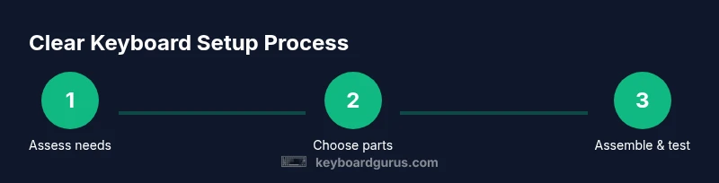
Steps
Estimated time: 3-6 hours
- 1
Define readability goals
Start by specifying what 'clear' means for you: high contrast, larger legends, or a specific font style. Document these goals so every later choice aligns with them. This clarity helps prevent feature bloat that can reduce legibility.
Tip: Write down a target contrast concept (e.g., light legends on dark keys) and refer back to it during every swap. - 2
Choose a base keyboard and layout
Select a layout size (full-size, TKL, or 75%) that doesn’t force cramped keycaps. Favor ANSI where the legend area is spacious and uniform. Ensure the chassis and plate allow even legend surfaces and don’t distort perception at a glance.
Tip: Avoid ultra-compact layouts if you struggle with keycap legibility under stress. - 3
Pick legible keycaps
Install a high-contrast keycap set with clear, bold legends. Prefer dye-sublimated legends on durable PBT for minimal wear. Check that the legends are centered, not cramped, to improve optical readability.
Tip: Test legends in bright and dim lighting to confirm readability across scenarios. - 4
Decide on switches and stabilizers
Choose switches that offer predictable actuation and minimal sound distortion, as excessive noise can distract emphasis on legibility. Stabilizers should be well-lubed and tightly mounted to prevent rattle that obscures key legends.
Tip: Avoid switches with a mushy feel that hides tactile feedback, which can impact timing and accuracy. - 5
Calibrate lighting for contrast
Set up a lighting profile that highlights legends without glare. Prefer uniform backlight or top-lit schemes with moderate brightness. Ensure in-room lighting complements the keyboard so legends stay readable in any environment.
Tip: Disable aggressive rainbow lighting for tasks that require rapid legibility; steady white or amber tones usually work best. - 6
Align layout with typing rhythm
Position the keyboard so wrists rest comfortably and the home-row feels natural. Maintain consistent spacing between rows and keys to reduce scanning effort. A clean alignment reduces visual noise and improves recognition.
Tip: Use a wrist rest that promotes a neutral posture and prevents slouching during long sessions. - 7
Micro-layout consistency check
Verify that key sizes, shapes, and spacing remain consistent across the board. Inconsistencies or nonstandard sizes disrupt visual scanning and slow down typing speed. Make adjustments as needed to restore predictability.
Tip: If you swap layouts frequently, keep a legend sheet or label to remind yourself of changes. - 8
Install and test per-key lighting (optional)
If you use per-key LEDs, map each key to a readable brightness level. Test in different ambient conditions to confirm the legends stay visible. Per-key lighting can help, but only if it’s balanced and not overwhelming.
Tip: Start with a single high-contrast color and expand gradually to avoid distractions. - 9
Validate with typing tasks
Run representative typing tasks that you commonly perform: coding, gaming, or exams. Observe error rates and visual fatigue. Gather feedback from your own hands and eyes to guide refinements.
Tip: Record yourself typing to notice moments where misreads occur; adjust keycap legends or lighting accordingly. - 10
Iterate based on feedback
Make targeted changes: tweak fonts, adjust brightness, or swap keycaps. Small iterations focused on legibility yield the best results without overhauling your setup.
Tip: Change one variable at a time to clearly identify what improved readability. - 11
Document your setup
Create a reference sheet of your chosen keycap set, switches, lighting profile, and layout. This helps you reproduce the clarity you’ve built and accelerates future tweaks.
Tip: Keep a photo gallery and a simple note file with settings for future upgrades. - 12
Maintain readability over time
Regularly clean keycaps and inspect legends for wear. Replace worn legends quickly to sustain legibility. Schedule periodic checks to prevent readability from degrading with use.
Tip: Use a microfiber cloth and gentle cleaner; avoid harsh solvents that could fade legends.
Got Questions?
What is a clear keyboard, and why does it matter?
A clear keyboard prioritizes legibility of legends, spacing, and lighting to reduce misreads and fatigue. It matters for accuracy in coding, gaming, and study, and it helps your eyes track keys quickly without cognitive overload.
A clear keyboard focuses on readable legends, consistent spacing, and good lighting so you type more accurately with less eye strain.
How can I improve keycap legibility without changing my entire keyboard?
Start with a high-contrast keycap set and ensure legends are dye-sub or laser-etched for durability. Align font size and spacing with the keycaps to avoid crowding. You can gradually adjust lighting and layout while keeping the same base keyboard.
Upgrade to high-contrast legends and check alignment; then calibrate lighting and layout step by step.
Are backlit or per-key lighting better for clarity?
Backlighting that provides even illumination behind the legends tends to be more readable than flashy RGB. Per-key lighting can help, but only if brightness and color are balanced and consistent across keys.
Even backlighting usually beats flashy patterns for readability, though well-balanced per-key lighting can help if tuned properly.
What switches maximize readability?
Switches with predictable actuation and low stem wobble improve the tactile cue without creating visual noise. Stabilizers should be well-lubed to prevent rattle that can obscure the legends during quick presses.
Choose predictable, stable switches and well-lubed stabilizers for clean keypress feedback.
How often should I refresh legibility in a keyboard I use daily?
Regular checks every few months are enough to catch worn legends or uneven lighting. Replace keycaps or re-laminate legends as needed to maintain clarity.
Check legibility every few months and refresh legends or lighting if wear is evident.
Watch Video
What to Remember
- Define readability goals up front.
- Choose high-contrast keycaps and consistent layout.
- Calibrate lighting for even legibility.
- Test with real typing tasks and iterate.
- Maintain documentation for long-term clarity.